1(a)
Consumers usually use different variables to determine the quality of a product such as brand image, store image and price together as a product quality indicator.
The more highly customers think of Tim Tam, the more they are willing to pay for it. Firstly, Tim Tam emphasis the all ingredient comes from Australia Natural and healthy no genetically modified ingredient. Otherwise, Tim tam request all the ingredient come from natural no deforestation product such as sugar comes from Queensland, Cocoa Liquor which is the most important ingredient in giving the chocolate taste. By maintaining the perceived quality status Tim tam also can prevent customers from trying a competitor’s offering. Also, Tim tam is over 50 years in the market with a good brand image which also represent the core benefit that Tim tam provides.
Secondly, Consumers often respond positively to a well-known figure they trust or a recognized expert who gives an endorsement of a product or service. Arnott’s had recently created the hashtag #sharetheslam to promote the favorites way to enjoy a Tim Tam by asking everyone to share with their friend, their family, their work colleagues in order to promote that each Tim Tam Slam is unique to the individual. They use Australian celebrities to endorse Tim tam product (Instagram comedian Celeste Barber and Bec Judd) who have come on board for this campaign. Tim tam using experiential marketing strategy allows customers to engage and interact with the brand.
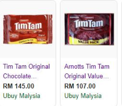
Thirdly, Tim tam also using Price-quality relationship strategy in the market, since consumer relies on price as an indicator of product quality. For example, one pack of Tim Tam chocolate cost more than 100 MYR in Malaysia. As compared to the lower value of chocolate brand customer more tend to buy Tim tam due to the consumer believe more expensive products are better.
Lastly, Arnott’s also using a store image to promote Tim Tam chocolate, since the retail stores have images of their own that influence the perceived quality of the products. Thus, Tim Tam chocolate is also selling in AEON supermarket Sunway Pyramid in Malaysia.
<https://insidefmcg.com.au/2018/10/15/australian-celebrities-join-arnotts-latest-campaign/>
1(b)(i)

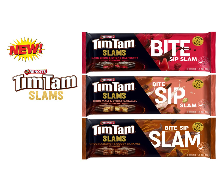
Tim Tam in Australia icon launched a new range, ‘Tim Tam Slams’ celebrating the unique aussie ritual of biting the corners off a Tim Tam and sipping a drink through the middle. Campbell Arnott’s engaged The Edison Agency to create a new strategic design solution for a seasonal, limited release that showcased the ‘Tim Tam Slam’ ritual as a platform for ownable distinction and growth (B & T Magazine 2019). In the packaging, we can see the package comes in different type of flavour, colour and each with a gooey centre to really add to the ‘Bite, Sip, Slam’ experience.
In my own view, the package is colourful, interesting and a bit playful, this will attract customer to buy it. Each package have developed ‘Bite, Sip, Slam’ that show customer different eating style and different experience of Tim Tam. Besides that, the quality perception on the package is in a good quality as well with the product, because of the colourful package and showing the ‘Bite, Sip, Slam’, it will make customer focus and choose their interest flavour and try. The Tim Tam Slam package compare to the Classic Tim Tam package, it was getting more attractiveness to customer. Package is important because if your package is look beautiful or cute or colourful, even though customer haven’t try the product before, the customer will buy because of the package. This will not only attract loyal customer, it also attract new customer.
1(b)(ii)
First of all, the packaging of Tim Tam delivers a message of boldness, with various words such as “BITE, SIP, SLAM”, indicating different playful scenarios and personalities of the consumers. Collaborating with various colours, the packaging itself can outshine the competitors’ products on the shelf in stores. Besides, the separated chocolate waffles also show off the ingredient as well as the generously engulfed stuffing. This may results in customers attraction for purchase. The red ‘ARNOTT’s’ logo above the word TimTam also provides consumer confidence in the product as it is a well known snacks distributer.
Moving on, the packaging of Hershey’s Chocolate bar are less playful when compared to the TimTam SLAMS packaging. The packaging focuses mainly on the company brand itself, due to the fact that Hershey’s is a well established company. The fact that they have the ‘est since 1894’ engraved beside the brand means that the company does not need a bold packaging as the brand name itself has already given sufficient consumers confidence. However, some packages of newer Hershey’s products comes with baby blue coloured sides. This was done for the packaging to stand out a little more between competitions on the shelf.
Lastly, the package of Reese’s is had infused emojis into the packaging to attract valentines’ customers. The use of emoji does not only attract valentines couples, but it can also attract children who are curious of the packaging. The bright orange colour combined with the emoji are easily identifiable and attractive to consumers. It increases the curiosity to consumers as it looks different from other chocolate brands.
2
Symbolism used in advertisement is proven to increase brand recall or enhance the memory of the advertisement for consumers, especially when the symbolistic representations in the advertisement strongly associates with the consumers’ daily life or previous experience (Boltz, Mangigian & Allen 2016, p. 1088).

The first advertisement that contained symbolism is an advertisement from Rape, Abuse & Incest National Network (RAINN), which symbolically showed a few pieces of paper being torn with force and formed the shape of a woman’s sexual organ, thereby revealing the main message of 1 In 6 women are being sexually assaulted in the United States (Rape, Abuse & Incest National Network (RAINN) 2010). The meaning conveyed from the symbol is the forcefully torn paper which signals that there are many women who are being forcefully assaulted without their consent, which also signals the permanent damages caused onto women who are assaulted, because torn paper can’t be restored without any mark left. This advertisement successfully communicated the happenings of sexual assault are around us, which can raise awareness on the issues, so that people may give immediate assistance when they realized that such tragedy happens to people around them, or allow the people who urgently need help to contact RAINN.
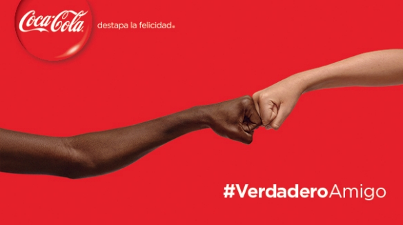
Secondly, I’m showing an advertisement from Coca-Cola which simply showed two arms with different skin colors bumping their fists together (Coca-Cola Company 2015). The both arms serve as a symbolic representation of true friendships regardless of skin color or other characteristics, along with the hashtag of #VerdaderoAmigo which means true friendship (Coca-Cola Company 2015). The advertisement had conveyed that Coca-Cola brings people with different characteristics together with strong bonds of friendships, which also signals that Coca-Cola can be shared with friends no matter who they are. Therefore, the symbol had also served as a sign of friendship, which encourages people to purchase Coca-Cola to be shared with other people and enjoy the true happiness from the true friendship (Tutssel 2010, p. 13). Moreover, the symbol had also conveyed superior product quality to the audiences, because it signals the maintained quality of Coca-Cola all over the world, which the taste suits large variety of consumers regardless of the demographics of the people.
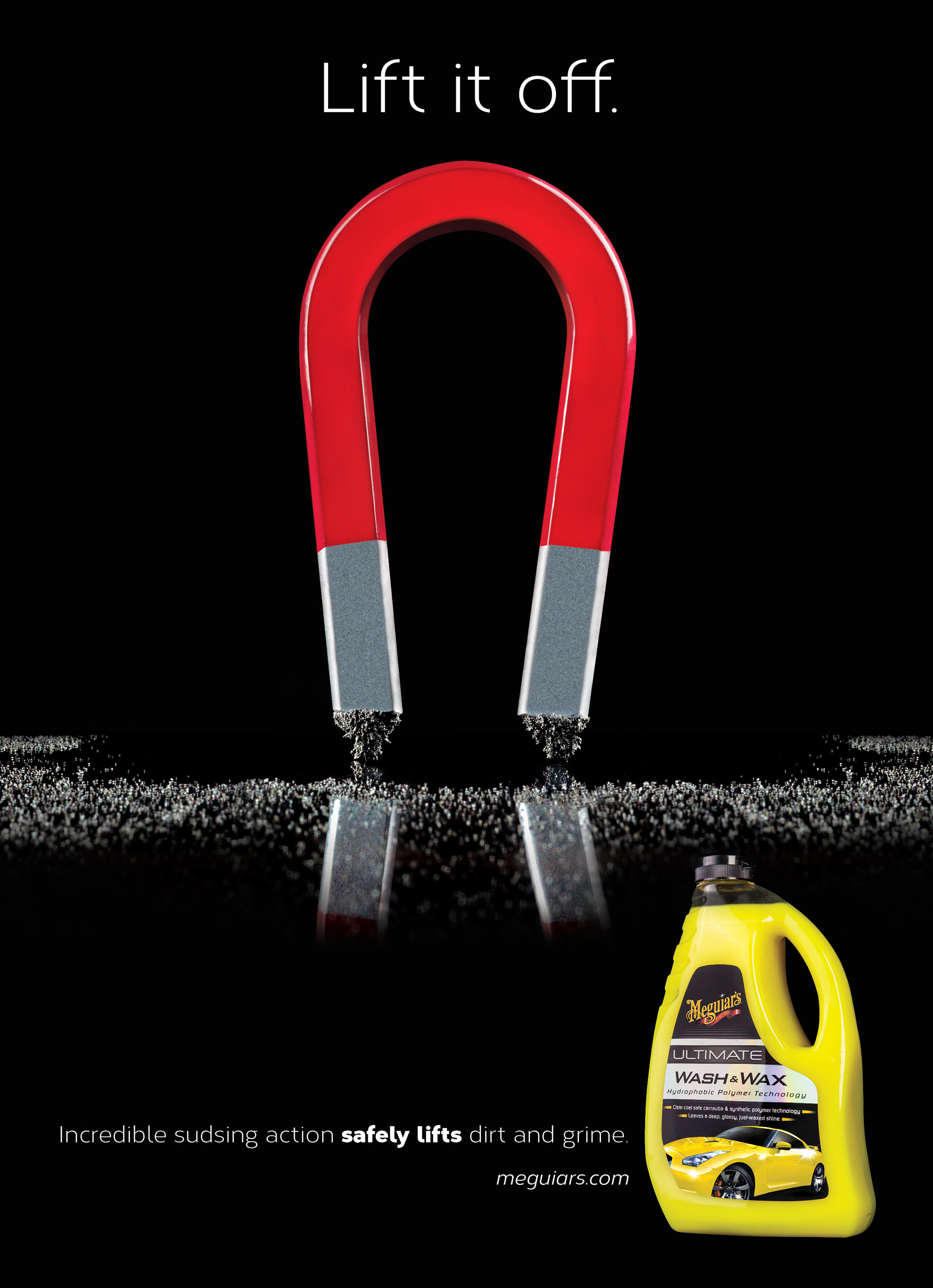
The third advertisement that is being discussed here is an advertisement by Meguiar’s, which sells automotive-related products such as car cleaner. The symbols used here is a magnet, which symbolizes the easiness of sucking the dirt from the surface of the car, just like how a magnet lifts the iron dusts away from the table top (Litt Designs 2015). The symbolism representation of a magnet shows that Meguiar’s car cleaner allows very easy application of the product, which the consumer does not need to use excessive force to scrub the car to clean the car. Furthermore, the advertisement had communicated the excellent quality of the product, which the car cleaner not only allow easy removal of dirt, but also avoid damage of the car paint due to overly harsh cleaner, thereby attracting customers to purchase the product to easily clean the car without hassles.
Written by:
Melissa Lee Ka Mun (5619300)
Wong Zhao Li (5617649)
Simin Chen (5694450)
Lee Yi Sin (6316931)
References
B & T Magazine 2019, Campbell Arnott’s Launches Tim Tam Slam Via Indie Group The Edison Agency, accessed 13/5/2019,
<https://www.bandt.com.au/campaigns/campbell-arnotts-launches-tim-tam-slam-via-indie-group-edison-agency>.
Boltz, MG, Mangigian, GM & Allen, MB 2016, ‘Phonetic Symbolism and Memory for Advertisements’, Applied Cognitive Psychology, vol. 30, no. 6, pp. 1088–1092, accessed 12/5/2019,
<https://search-ebscohost-com.ezproxy.uow.edu.au/login.aspx?direct=true&db=pbh&AN=120155685&site=eds-live>.
Coca-Cola Company 2015, Fist Bumps Symbolize #TrueFriendship in Coca-Cola Latin America Campaign, accessed 13/5/2019,
<https://www.coca-colacompany.com/stories/fist-bumps-symbolize-truefriendship-in-coca-cola-latin-america-campaign>.
Litt Designs 2015, Low Key Lighted Advertising, accessed 14/5/2019, <https://littdesigns.com/low-key-lighted-advertising>.
Rape, Abuse & Incest National Network (RAINN) 2010, Powerful Advertising, accessed 12/5/2019,
<https://www.pinterest.com/pin/359725088957305982/>.
Tutssel, M 2010, ‘Were creatives bowled over by Super Bowl ads?’, Campaign, 12 February, no. 6, p. 13, accessed 13/5/2019,
<https://search-ebscohost-com.ezproxy.uow.edu.au/login.aspx?direct=true&db=bth&AN=48316755&site=eds-live>.
